CASE STUDY - REDESIGN
UFC
Website Redesign - UFC Fight Pass
Challenge: The UFC Fight Pass website is a premium website for UFC subscription packages. The site was outdated, had several architecture issues, lacked ability to update easily, and had a video player that was unable to keep up with new video quality technology.
Solution: The UFC Digital Team redesigned the entire UFC Fight Pass website to solve these problems along side a digital design group.
My Involvement: I was in charge of all UX (research, strategy, design, IA) - and managed a team of developers and content coordinators. I also provided any design changes to the redesigned screens as a result of testing or friction points.
Process: Competitive Analysis, Stakeholder Interviews, User Testing, Analytics Reviews, Surveys, NPS, Remote Usability Tests, Scenarios, Experience Mapping, Wireframes, Development Roadmaps, Q&A, A/B testing, Voice of the Customer, Optimization Testing
Platforms: Desktop (responsive website) and mobile web, iPhone & Android app, connected devices
Key Stakeholders: SVP of Digital, Head of Product, Neulion (tech partner), Content, Marketing, Design (3rd party partners), offshore developers
Strategy Stage
My involvement in the UFC Fight Pass redesign began at the end of the Strategy stage and the beginning of the Research + Analysis stage. UFC stakeholders knew WHY they wanted to redesign the site, but they didn’t know HOW to guarantee that the new design would solve all of their problems. That became my job.
Testers wanted a new look, as well, but wanted more content, and easier-to-find content. As a result of all of the actions taken during the Strategy Page, I created these 3 goals:

1. Reduce number of errors and friction points for top 3 UFC Fight Pass Experience tasks by 40%.
2. Improve the IA of the website to improve findability to 3 major tasks and beyond.
3. Update aesthetic to match the new UFC rebranding.
Process:
Stakeholder interviews – I met with several members of the UFC team to discover the business goals behind the redesign.
Analytics review – I looked at analytics to find red flags, abandonments, errors, and friction points.
Competitive Analysis– I did research on competitors pages to see what they were doing.
User/Usability Testing- I began testing users on the old website to illustrate friction points.I conducted both in-person user tests, as well as unmoderated remote tests. I also tested competitive sites to gain insight.Testing occurred across all devices (iPhone/Android mobile web & apps, Desktop web,Connected Devices: Apple TV, Fire Stick, X-Box, PlayStation, etc.).
Stakeholder interviews helped to define WHY the website needed to be redesigned. Numbers of subscriptions had dropped. Customer complaints were on the rise. Customer service had experienced a drastic increase in cancellations and complaints about look, feel, and navigation of the site.
These interviews also showed me that the business wanted a cleaner look and easier IA. Analytics showed major friction points throughout the old site. Competitive analysis showed a cleaner design from others, but showed that others also experienced confusing IA. Competitive analysis showed us that we had an opportunity to lead our industry in experience. Initial user testing and interviews highlighted many of the same things that we saw in analytics. The old site didn't scale well on new devices. The IA needed to be re-built and we discovered the need of a synonym dictionary, as well as overall improved search and navigation. The look at feel of the site was also just outdated. All of these supported the business' decision for a redesign.
Purpose: To illustrate the UX process utilized throughout the UFC Fight Pass redesign

Video of general sentiment feedback during in-person usability tests.
I recorded findings in Google Docs to keep organized & to share with the team
Research + Analysis phase
During the Research + Analysis phase of the UFP website redesign, we put our ideas to make changes to the test. I worked with a 3rd party UX firm who took my tests and we collaborated on new design. Iterations were made to get the website in the best place possible before a launch.-
Surveys– I asked customers what they liked / didn’t like about the new/old design/prototypes.
Competitive analysis – When we discovered more friction points, we checked to see if ourcompetitors had the same friction points. We also looked to see how others fixed the friction points.-
User Testing -We tested the new design using prototypes in Invision (I converted paper prototypes into digital prototypes, then wireframes into digital prototypes for a quick turnaround).I tested across all devices, and with multiple sets of demographics (i.e. UFP current subscribers, previous subscribers, non-subscribers, Mac users, Mobile users, Connected Device users, etc.)-
Remote Usability Tests – I sent tests with key tasks to hundreds of users to see if task completion improved over previous designs.-
Scenarios– I wrote scenarios for the developers for improvements to the development roadmap.-
Experience Map – I created an experience map and mapped out IA for the entire UFP experience.
Story Map - Planning stage to create requirements for designers / developers / stakeholders.
Personas - Created personas to assist in the design stage.

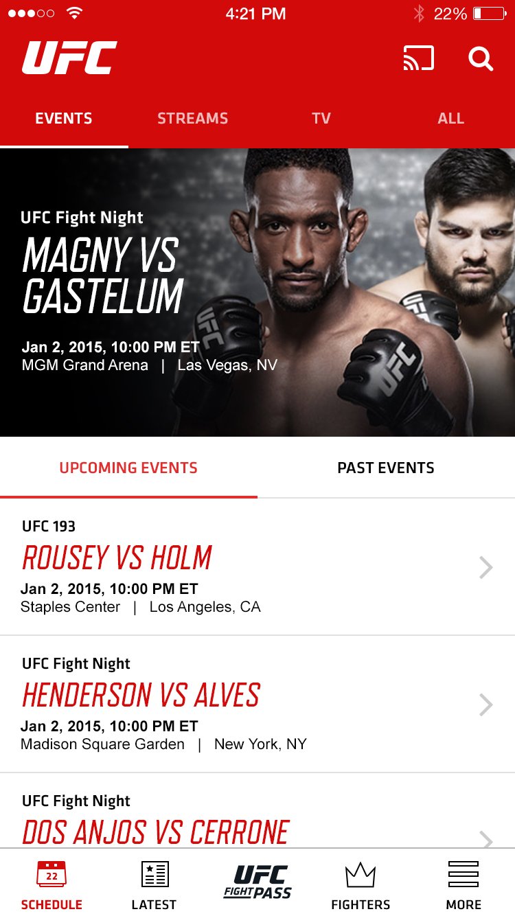
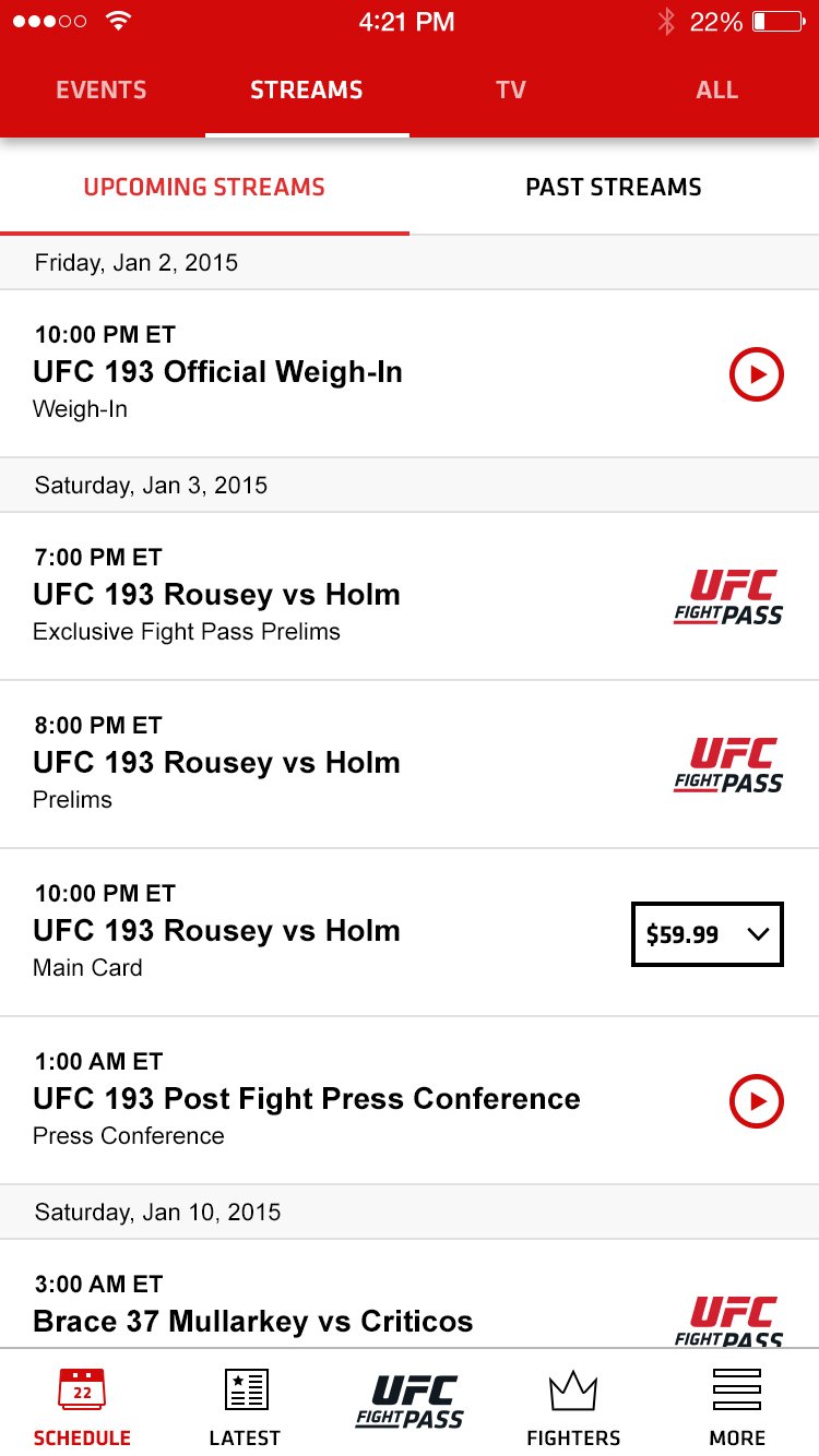
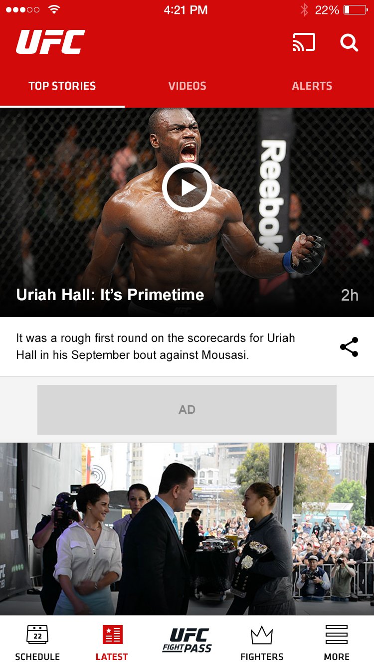
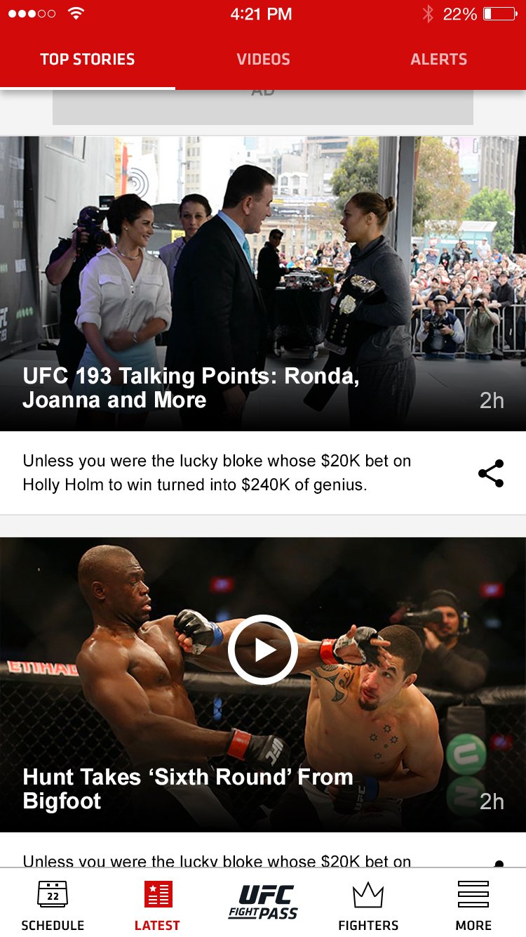
Example of original design friction
Please note: Research + Analysis stage occurs simutaneously during part of the design stage.
Example of Improvement:
Prior to release, we learned that there were several points in the design that were flawed. 100% of desktop testers failed to complete the onboarding process in under 1 minute. When compared to the mobile number of completion in a much faster time, I uncovered a friction point. The original design of the onboarding included a large header. Since the page was responsive, if the user’s monitor was larger than a specific size, the break point was too large, and the header covered the entire page, causing confusion of how to move to the next step.
Design Fix:
I re-designed the header to be much smaller, and improved the breakpoints for the responsive design. The site was released with the new design, and analytics proved that the improvement worked!
Design Stage
During the Design Stage, I worked hand-in-hand with developers, assisting them with all translation between wireframes to development. I also continued conducting research to ensure that the designs held up with our users.

Wireframes – Full, hi-res wireframes were created by the 3rd party UX firm with our team’s help. I created all deliverables after the 3rd party handed off their final designs (pre-dev).
User Interviews/ Usability Tests (Remote) - I ran more tests on each design iteration.-
Diary Study – I had users document their days & any UFC touchpoints (digital or non-digital) toensure that we had all bases covered with the new design.
Development Roadmap Creation - I created a document to keep track of all changes to the designboth pre & post development.-
Card Sorting - I conducted several card sorting activities to determine a more-improved IA.


Customer Praise

Production + Optimization
Optimization Testing
Usability Testing
Remote Usability Testing
Development Backlog Management

This was the original UX roadmap. I highlighted where the enhancement was and on which device. I also briefly explained the issue, as well as recommendation. Links to the friction point were included, as well as status.

Testers from the In-person usability tests