BBW - Taxonomy Research
Taxonomy Research & Testing
Challenge:
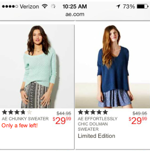
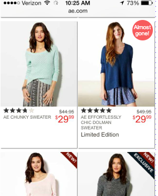
Bath & Body Works as a company has a very strong category offering. They are well known for their candles and body sprays, but they sell many items beyond this.
As a focus on omni-channel increases, Bath & Body Works was looking to learn how to increase findability of products on their site. Plus, customer sentiment highlighted a need to re-organize items into categories that promote and highlight the product offering - while not hiding the customer favorites.
My previous experience in creating and managing e-Commerce ontologies & Taxonomies has led me to be in charge of the Taxonomy Research efforts. My goal is to highlight what challenges we currently have, but also how to reduce those friction points in the future.

There were a number of items that we wanted to learn, and so we mapped those out prior to running the research efforts.

I proposed a timeline to map out the important research key points.


Research Execution
BBW did not have the capacity to complete the research in-house, and so we partnered with a 3rd party company - locally to Columbus Ohio (where our corporate challenge) - Priority Designs (PD)
20 participants
Online shoppers, average
Screened out Super Users (since they have learned bad habits already on site, and we gathered their information prior)
Skewed women
Split the research into multiple facets:
Card Sort - participants were asked to organize key categories together based on what they’d expect to see when shopping for these items.

Tree Test - participants were asked to find items from the previous card sort in a hierarchical fashion.

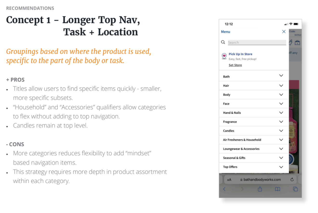
From the findings of those research efforts, there were 3 main taxonomy/ navigation structures that were chosen to further test against the existing BBW navigation.

from the PD readout
from the PD readout
Taxonomy Multivariate Test
We took 2 test concepts and tested them up against the existing navigation structure on site.
The test was taken down before reaching stat. sig. and will need to be run again in spring.
IGT - Fake Tree Bank App
Fake Tree Bank
Fake Tree Bank was a low-fidelity wireframe proposal for a banking addition to the IGT software. This was purely a concept that was proposed to the team for ideas for growth, as many casinos double as banks for locals. These wireframes were utilized to explain these concepts.
Challenge: Banking is not a current IGT program, however, there are banking related software packages that they own. The bank site must be mobile and desktop, with a mobile app to be supplemented. Only ONE app and one web view would be available for both employees and customers, which required two logins - with role-based permissions.

App Splash Page

Mobile Login Screen

Desktop Login for Banking + Employee (requirement was separation).

General Manager Dashboard

Branch Manager Homepage - This illustrated an employee dashboard, showing user-based information.

Customer View - Mobile
IGT - Fake Tree Bank
Fake Tree Bank
Fake Tree Bank was a low-fidelity wireframe proposal for a banking addition to the IGT software. This was purely a concept that was proposed to the team for ideas for growth, as many casinos double as banks for locals. These wireframes were utilized to explain these concepts.
Challenge: Banking is not a current IGT program, however, there are banking related software packages that they own. The bank site must be mobile and desktop, with a mobile app to be supplemented. Only ONE app and one web view would be available for both employees and customers, which required two logins - with role-based permissions.
App Splash Page
Mobile Login Screen
Desktop Login for Banking + Employee (requirement was separation).
General Manager Dashboard
Branch Manager Homepage - This illustrated an employee dashboard, showing user-based information.
Customer View - Mobile
IGT - Cashless Case Study
Challenge: As a result of Covid-19 and modernization attempts at casinos, IGT was shifting towards a CASHLESS program for casino systems. While casinos were planning for cashless implementation prior to 2020- the pandemic increased the speed at which this was required.
We also have multiple pieces of software - the software for the end user (the casino customer interface), the casino (management software), and internal Customer support software (health of the system, etc). We had to research each of these pieces independently - as they all had separate needs.
User Problem: The problem that we were addressing for users was that it can be expensive to fund games utilizing an ATM on property. These ATM’s historically cost between $5-$30 per transaction. Users were leaving casinos to look for cheaper funding methods, or just ending their gaming and leaving.
Casinos also had the added benefit of those who fund via cashless traditionally increase spend due to the lower transaction fee on the ATM.
Process:
My role in this project had multiple steps:
Identify core casino customers (personas) to call out the core groups that are utilizing cashless systems
Illustrate the journeys of these personas (user journey maps)
Conduct Usability Testing on existing CASHLESS software with paying casino customers (in a casino environment)
Compare our products to the offerings from competitors (competitive analysis)
Make strategic recommendations for the business for existing software and missed areas within the business.
Direct the design of completion of the project.
Personas

Method:
In order to collect information about core customers of casinos, I teamed up with our marketing research team. I compiled findings from one year’s worth of data via surveys, user testing, focus groups, etc. I also interviewed key stakeholders within the company who work 1:1 with casino customers. I also helped to inform focus groups regarding cashless and casino gaming. All of this information was then converted to core customer demographics, gaming information, personal life, etc. to capture 6 core casino personas. By creating these personas, we can better envision the actions of our customers.
For our internal facing software, we created personas based on the core employees and their positions. We met with them several times over a number of years to learn about challenges that they had (such as using multiple pieces of software to complete one journey task) and missing pieces that they needed the software to be able to complete.
User Journey Map

A page from the user journey map of a core persona representative.
Method:
After gathering information from key stakeholders, I mapped out a “typical” journey for each core persona. I utilized Real journeys from each persona, and utilized actual comments from customers.

Usability Testing

A readout page from the internal software remote usability testing report.
Method:
We had a number of Cashless products already in development while we were working on the final project. We took those pieces of software and partnered with local casinos to test the cashless prototypes with actual paying customers.
We split the sessions up by software type and then optimized in an Agile methodology. Once completion of the software was at a point that all pieces were in a good spot, we tested the end-to end experience - from connecting your phone to the machine, uploading and downloading funds into a slot machine, contacting CS when there is an issue, etc.
One of the main challenges that we found was the connectivity in casinos was not the best. Several optimization projects with casino tech was upgraded during this time. Sometimes outside factors can interfere with what you are testing. But - it’s better to see this in testing than to experience it with all customer while live.
Since IGT was also building out the internal piece of software for our tech call center, we performed remote usability testing with them.
Competitive Analysis


image from IGT - https://www.igt.com/-/media/805ce0c5ff6940bb99e3a61faf50e5e6.ashx
I did not design this screen, but I did test this specific piece of software
Final Designs
While I am unable to share any of the final designs (due to privacy and legal requirements), I can describe the software that we designed, and some of the key points & UX changes.
We created a holistic cashless app for the customer to connect to a slot machine - It had a digital wallet where the user can upload funds into a machine, and push funds back to the digital wallet.
We created software for the casinos to manage the cashless relationship.
We created software for the tech Customer Call Center to assist with cashless challenges and funding issues. One of the UX challenges that we found was that the IA (information architecture) or layout that was originally planned for their core software was a bit disjointed. You had to remember or write down customer information because the system didn’t retain it. We worked with the development team to improve the carry-through of customer data through different user flows, and this challenge was resolved.
A second challenge was that this specific user has multiple software systems (all from IGT) that do not speak to each other. So - a user might have to type in the same information across multiple pieces of software to complete a task. This meant combining certain items into less pieces of software (with the intention of eventually reducing as much as possible).
IGT - (Leadership) Mobile UX Recommendations
One of my responsibilities is to oversee the work of several designers and developers (both internal and 3rd party).
In this example, a 3rd party UX designer created the app for Cardless Connect. However, after development, I was brought in to provide feedback. I created a 30 - item response for improvements to the UX portion of the app.
The early example of the mobile app had multiple usability issues.
Recommendations ranged from removing explanatory texts, providing more user feedbacks after actions are taken, and making objects clickable that resemble buttons (where users would want to see more information about what’s seen on the element.
Final recommendations:

We need to decide what the goal of the user is??
Is there too much presented?
Moved important elements to the top (Account CTA – on all pages, Deposit Button), Connect to Game CTA, Manage Funds CTA).
Added titling for consistency with rest of app (best practice)
Removed text and added tool tips to hide messaging but provide way in UI to allow users to read that note if they want to. (Move important items above the “fold” or in high-traffic areas).
Recent Transactions should be clickable – take user to transaction history or to the actual transaction shown. (Existing Mental Model – learn from other websites usage).
Added FAQ and Cardless setting to bottom. FAQ to help alleviate fears and instill trust. Cardless settings to give room for more important aspects of page (funding/account)
Added title to be consistent across app

Renamed History / Transaction History (it was named 2 different things in the app. Not consistent) to Wallet Funding History. (Consistency)
Changed UP and DOWN to PLUS AND MINUS
Added in text to explain that this is FUNDING or WITHDRAWN to CLEARLY explain what happened. (The wallet had funds added or withdrawn!)
Manage Funds Page should be redesigned to match UI of app.
Before snapshot:

After snapshot (NOT PIXEL PERFECT - this was for explanation - QUICKLY - only):

After testing, we discovered that the users definitely wanted a simplified page and wanted the “CONNECT TO GAME” and “MANAGE FUNDS” CTAs above the player’s card. This was my suggestion for simplification.

Example of correspondence for the UX designer.


IGT - Usability Testing
Prior to launch of a new software, I wrote a test plan, test script, and met with stakeholders on the project to ensure that the testing covers all questions and uncovers the maximum amount of usability issues.
Once the test plan and script were signed off on, I ran a number of usability tests to create a backlog of optimization opportunities for post launch.

I collected video of the testers in areas of key callouts.
Once the testing was complete, I created a test report - which gave examples of the usability challenges and friction points.

I provided a summary of the testing to provide a summary of the findings and recommendations.


I created a multiple-page test plan to explain every detail of the testing.
IGT - Complex AML Withdrawal/Deposit Flow
CONFIDENTIAL - PLEASE DO NOT SHARE
Challenge: A large casino customer required an update to the software that the Cage employees utilize to collect data for Anti-Money Laundering.
The challenges presented were providing an easy UI flow (utilizing existing UI design) to collect information on deposit and withdrawal, and suggest to cashiers what denomination to provide to Players.
Purpose: The purpose of these wireframes were to help lead the conversation with the casino customer to gain a better understanding of their requirements.

This design provided a way for cashiers to see a large amount of denominations to add to each payment type. This design allows for easy editability.

This design allows the cashier to get a better view of what is on deposit for cash, while being able to specify for each denomination what will be withdrawn all at once.


While presenting new ideas, I also made recommendations to the current UI - such as moving the CTA (call to action) onto the modals to meet standards, but also for better usability. Related CTAs should always be as close as possible to the actions being taken.
Sculpt Nation - Checkout (One Page)
Challenges: I was tasked with updating the checkout for SCULPTnation. After completing a heuristics report, I worked with the Director of Product to update the style of the UI and remove several negative UX Patterns from the website.
The new design provided the following updates:
One page checkout - The previous version had 6 steps to check out. We proposed a simplified one-page design to reduce the high number of abandoned checkout flows.
Order Summary - The order summary shows the product image, product title, cost, and total subtotal of the cart (pre-shipping cost).
We placed a login area where the user can log into their accounts directly in the checkout flow. Previously, it was located outside of the flow, causing the user to abandon their shipping flow.
Zip Code - auto-fill added to state when zip code is entered.
Saved Payment Information - CC was the only payment method allowed, but we added the option to save payment information for future usage.
Account Creation after guest checkout is submitted - We changed the flow for New Account Creation so that the user didn’t have to enter their information twice: once for signup, and once for checkout.
Device detection - The previous site was not responsive nor device specific. We changed the site to detect device and provide a specific experience for each device.
Skeleton Loading Pages - At the bottom of this page, you’ll see the proposed skeleton pages.

Mobile Checkout - Full page screenshot.

Desktop Checkout

Tablet Checkout

Tablet Skeleton
VShred - Trainer Tool (Back Office)
Challenge: VShred doesn’t have one program that houses all back-office functionalities for Trainers and Customers.
Solution: Designing a fluid backoffice Trainer app will allow the trainers to maintain every part of the customer journey - while offering customers an easy one-stop-shop for all of their information, programs, and plans to be housed.
Method:
High-Fidelity wireframes (Adobe XD)
Low-Fidelity wireframes (Adobe XD)

Log In Screen

Ticketing System Dash

User Dash

Privacy Policy

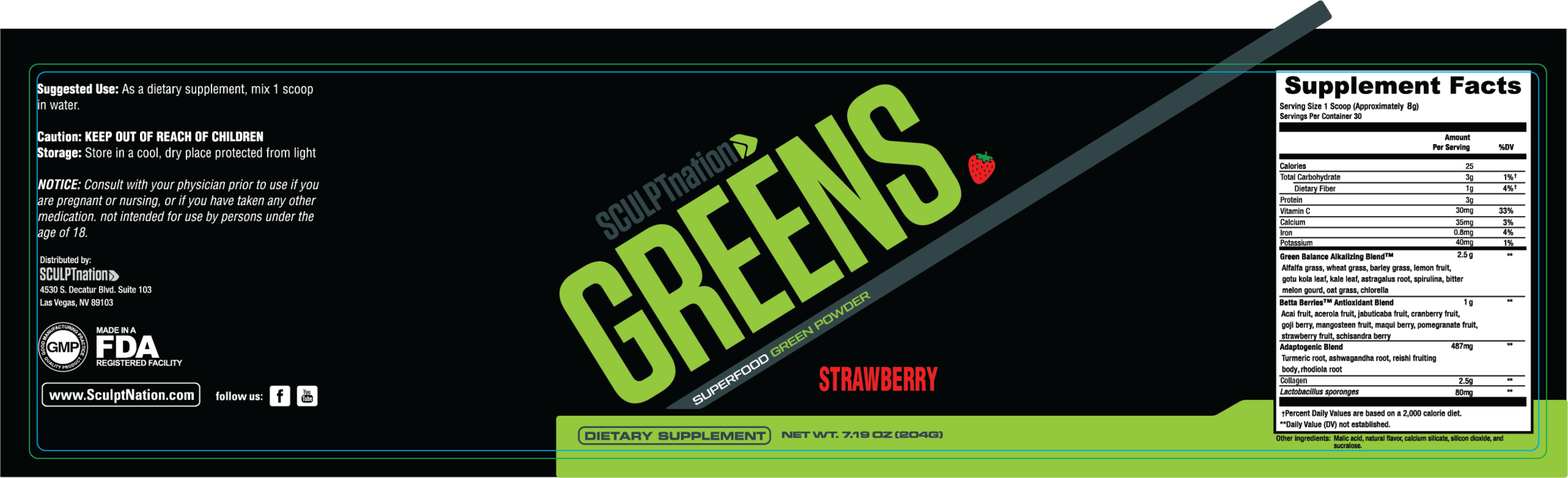
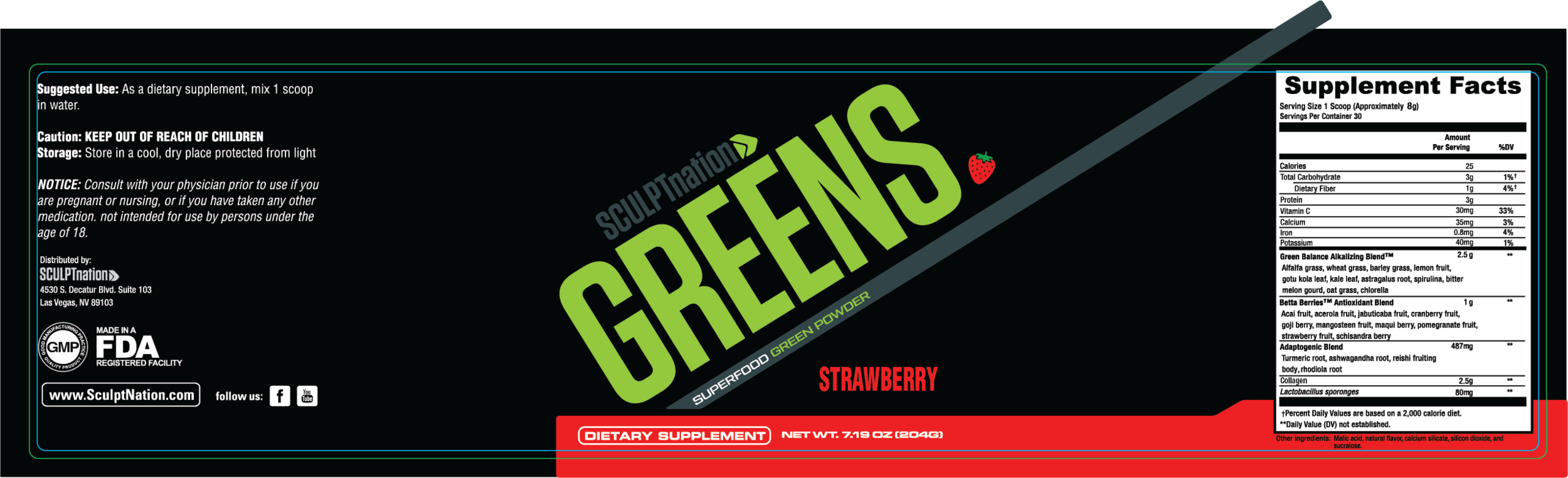
Product Labels
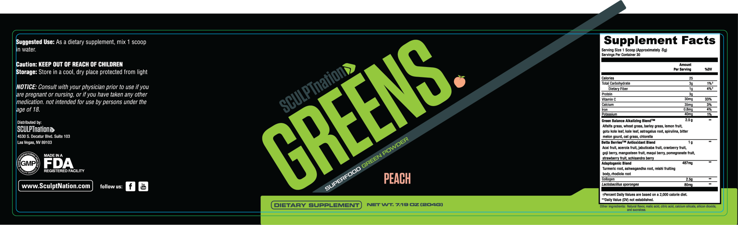
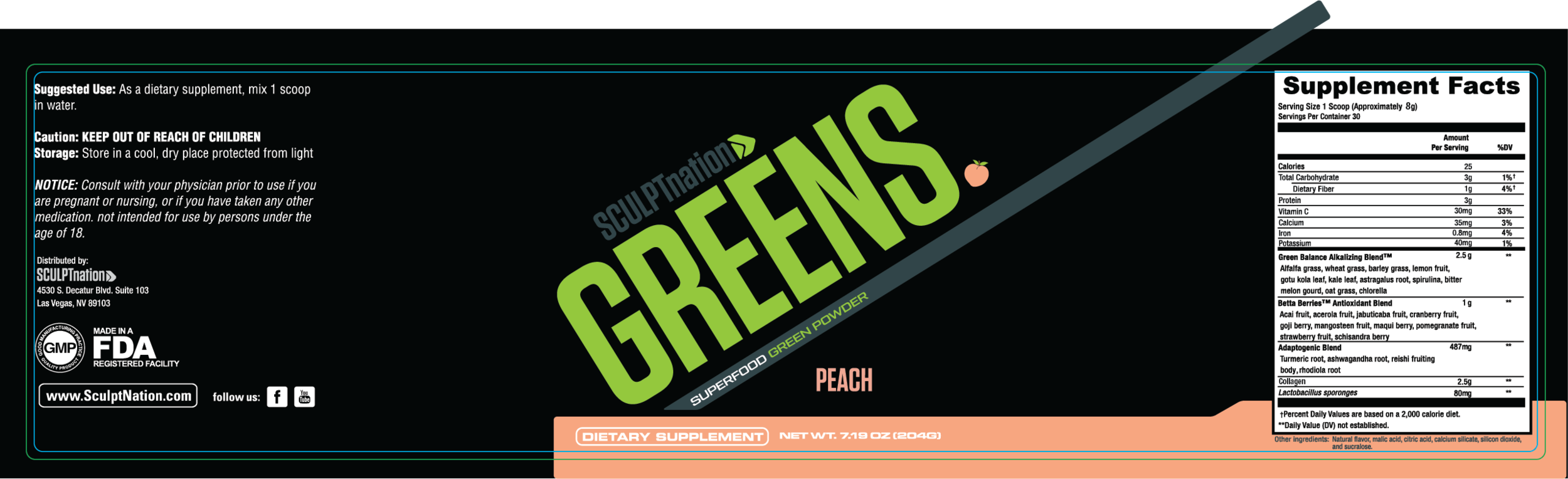
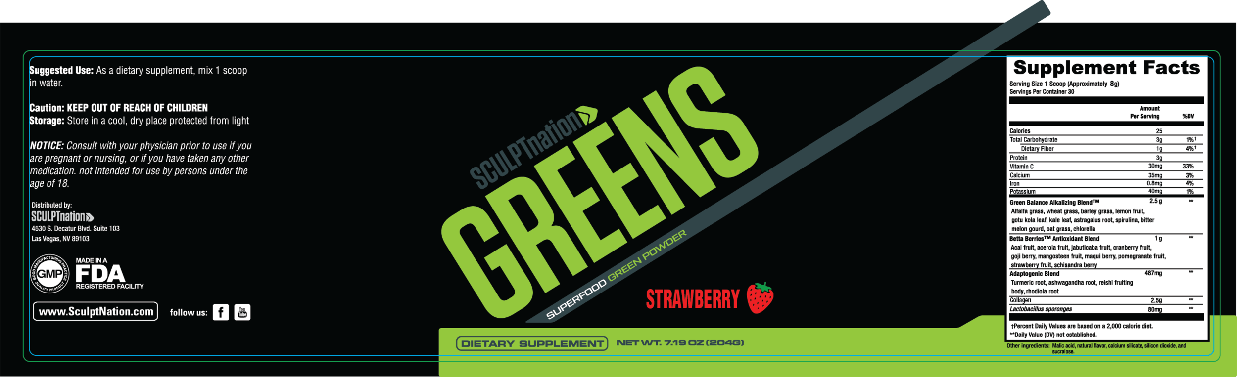
Challenge: SculptNation is adding new flavors of an existing product and needed labels. These are the proposed designs.


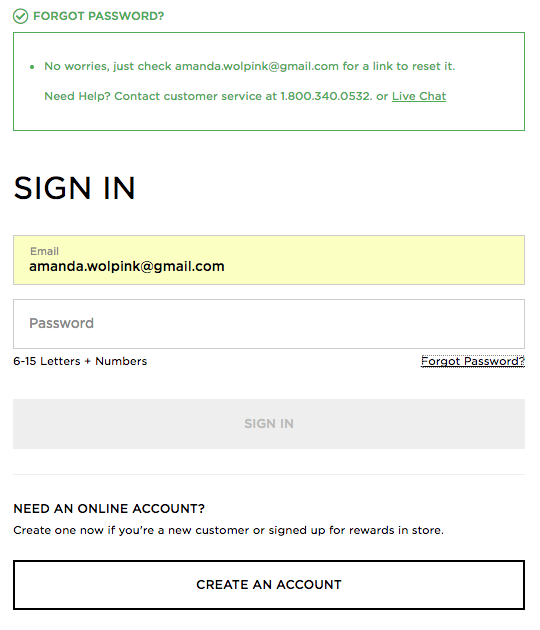
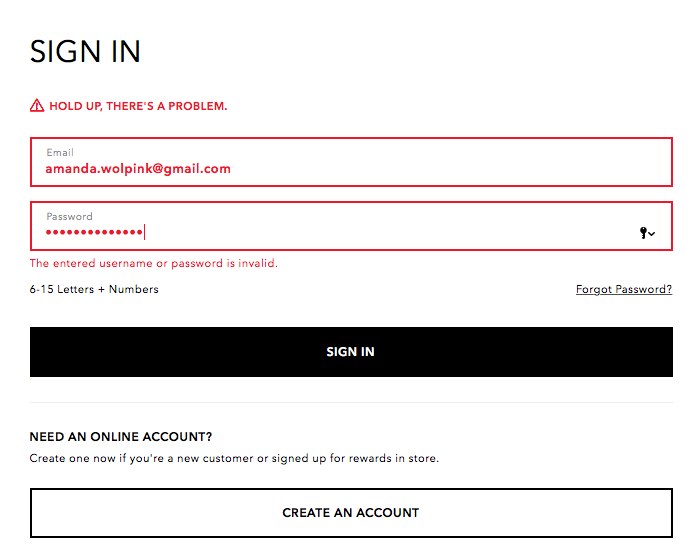
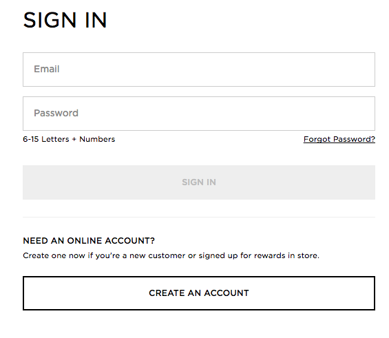
American Eagle Outfitters - Forgot Password Flow
Competitive Analysis
Personas
Login Scenarios
Review of Current Login Flows
Wireframes
User Stories
Error Message studies
Error Message re-write
Competitive Analysis


Login Personas

Review of Current Login Flow

Wireframes
Video Usability Testing of Flow
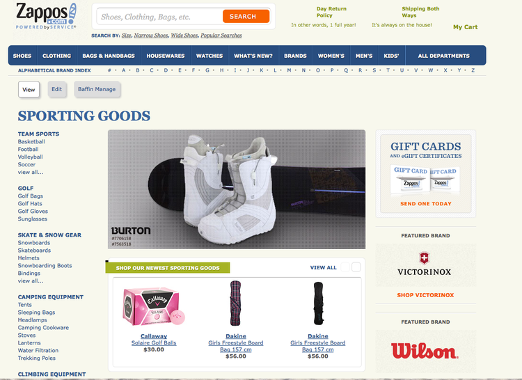
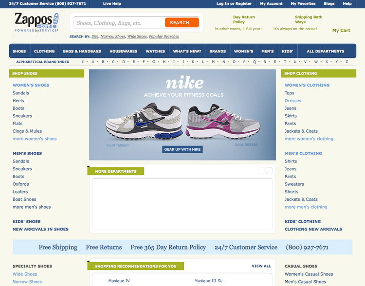
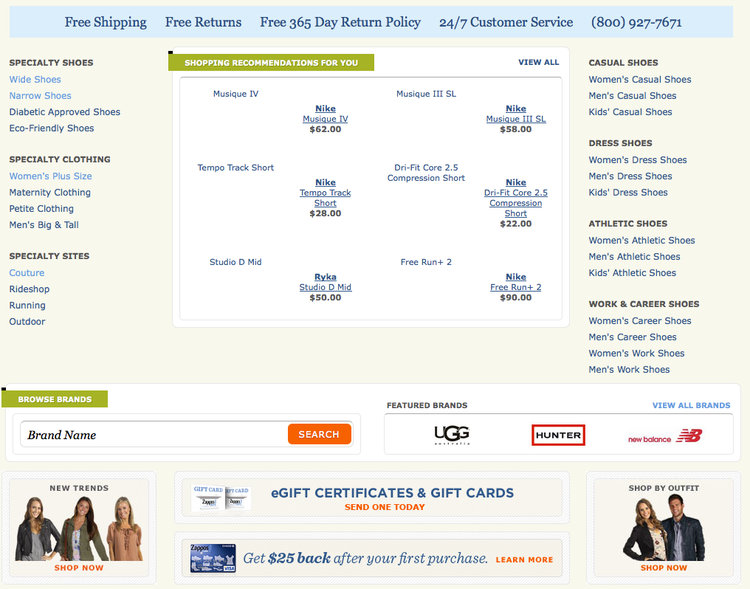
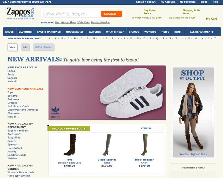
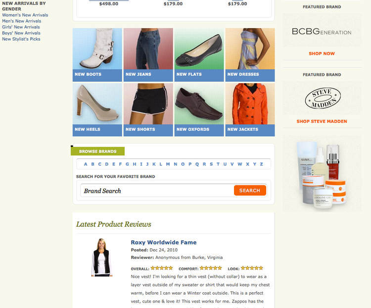
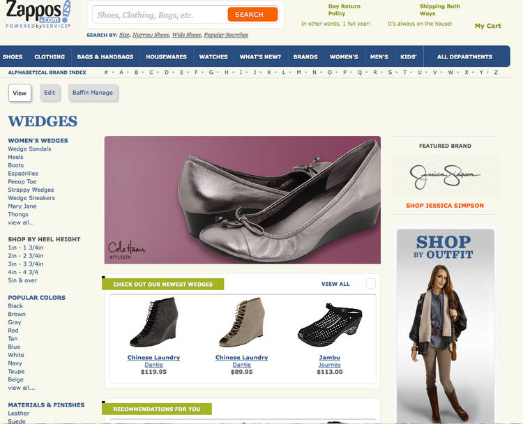
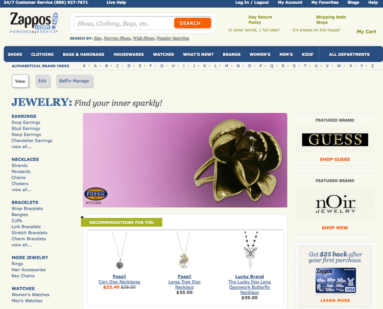
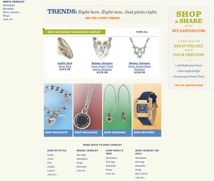
Zappos - Information Architecture (Taxonomy) & Site Merchandising
Advanced Landing Page Creation (Baffin) & Homepage layout
Taxonomy
Faceted Navigation
Site Merchandising
Process:
Competitive Analysis
Analytics review
Drupal/ Baffin CMS
Card sorting
Usability Testing
A/B Testing

We started with tree testing. Once we did this testing, we created the taxonomy on post-it notes on a whiteboard before entering into Excel.

We then placed the taxonomy hierarchy, including attributes, into an Excel spreadsheet to share with the Search team.
Once the taxonomy is created, we would build out landing pages with Baffin (Drupal) for key products categories, key brands, and more. These landing pages assist with SEO and assist users in flowing through the website. Analytics helped to decide which search terms were utilized most, and we turned those into pages. We could then track the success of the pages with analytics, and make changes based off of seasonality, trend, and user preference.

American Eagle Outfitters - Find a Store
American Eagle Outfitters Store Locator
Competitive Analysis, Wireframes
Desktop, Mobile Web, iPhone App, Android App
Challenge:
AEO was in need of an updated store locator on both desktop and mobile web. Before the competitive analysis, I already knew that I had several problems to solve. There was no way to single out AEO-owned stores (such as Aerie or Factory). There was also inaccurate hours during the holidays due to the way that the previous locator was designed. Future iterations were to include individual store pages.


Process:
Competitive Analysis
Stakeholder Interview
Low-Res wireframes
Hi-Res wireframes
What was Improved:
Filters for properties (AEO, Aerie, Factory)
Store Indicators adhere to design standards
CTA button design upgrade
Mobile-optimization
Directions to stores
Extended & holiday hours
Future iterations were to include individual store pages


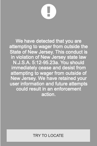
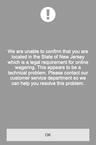
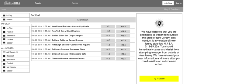
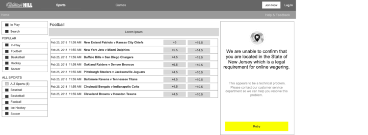
William Hill - New Jersey Mobile App Creation
New Digital Products - William Hill
William Hill New Jersey Gaming Site/ App/ Kiosk
Competitive Analysis, Wireframes, Interactive Prototypes
Responsive Website, Native iPhone App, Native Android App, Native Kiosk App
Challenge: The US Supreme Court overruled the decision on PASPA, making sports gambling legal across the United States. William Hill, the leading Sports Gaming company in Nevada (and a major contender in London and across the world) was tasked with creating all digital products for the New Jersey launch. Each of the user touchpoints also must meet state regulations.
Method:
Competitive Analysis
Stakeholder Interview
Low-Res wireframes
Hi-Res wireframes
Usability Testing
What was Created:
ACCOUNT PREFERENCES
Mobile
Email Templates
Bet Receipt
Email Footer
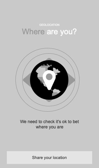
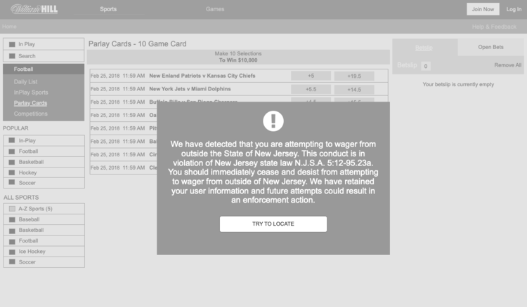
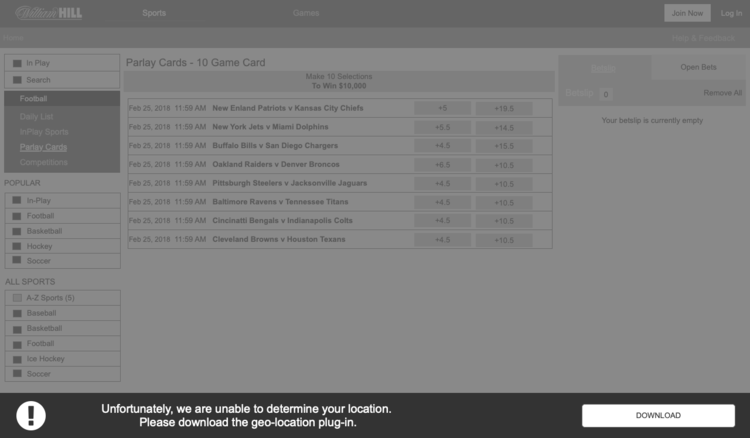
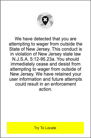
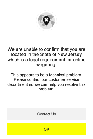
Geolocation
Self-set gaming limits
Login
Parlay Card
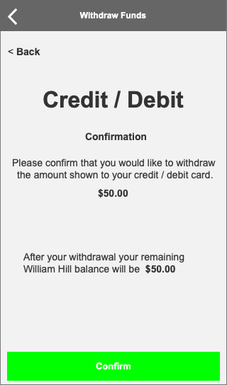
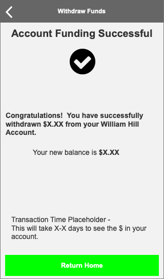
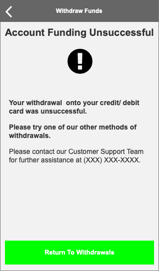
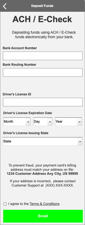
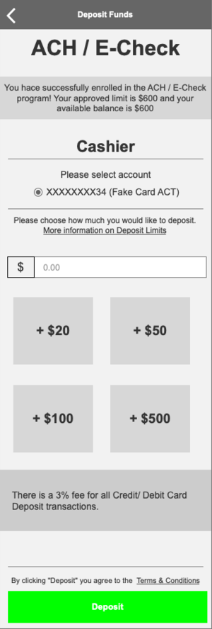
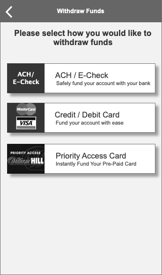
Payments
Registration
Self Exclusion
Cool Off Period
Tooltips
Welcome Emails
I was tasked originally with creating an HTML template for Welcome emails. However, our system had limitations in DAY 1 release for NJ that only allowed system emails to be text.
To the left, you’ll see the original low-fi wire for the welcome HTML email. To the right, you’ll see the actual non-HTML email that is in production.


Geolocation Wireframes


Payments Wireframes


William Hill - Nevada App Redesign
Challenge: The Nevada mobile app has not been redesigned in over 5 years. The limitations included having a 20-year-old back end that won’t be updated.
Solution: Researched the current mobile experience and located friction points. Updated branding (colors and logos) to current design. Refreshed architecture to aid with findability.
Method:
Research - in person
Low-Fidelity Wireframes (Axure)
Hi-Fidelity Wireframes

Some Key Changes to the design:
Added a splash page for the app
Provided an updated password process that allows the user to actually update password.
Updated the hierarchy of the items.
Created an easy way to deposit funds - right from most pages.
Turned plain text information into stylized text with a focus on easy readability.
Updated the timeline so that users could see when in-play events were taking place.
Provided information about the user’s account (such as name and amount of money on deposit) right after login.
Updated the marketing to match the requirements from the style guide (updated imagery, colorways, and logo).
Provided an easier-to-read win-loss (Transaction) history by adding color-coded indicators.


Old Designs


Sculpt Nation - UX Audit
Challenge: Sculpt Nation is planning a complete redesign, including bringing ownership of the code in house on a new platform.
Solution: I created a UX Audit on the old design and proposed new design and presented to the product council.
Method:
Airtable
Google Docs

VShred - Back Office - Meal Builder
Challenge: VShred sells customer meal plans. However, the trainers who build the plans currently have to build these plans utilizing a manual process that creates a PDF document. If a user requests changes, the trainer has to re-create the entire PDF.
Solution: Designing a fluid backoffice app will allow the trainers to build dynamic plans that can be changed and sent without redoing the entire plan.
Method:
Low-Fidelity wireframes (Adobe XD)
High-Fidelity wireframes (Adobe XD)
Meal Builder
Tablet Login Screen
Skeleton Pages


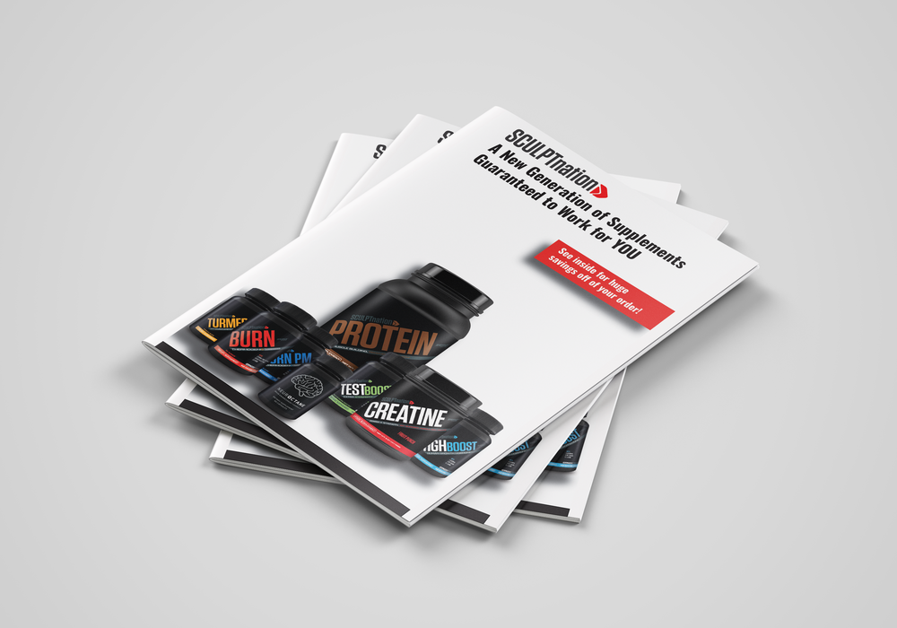
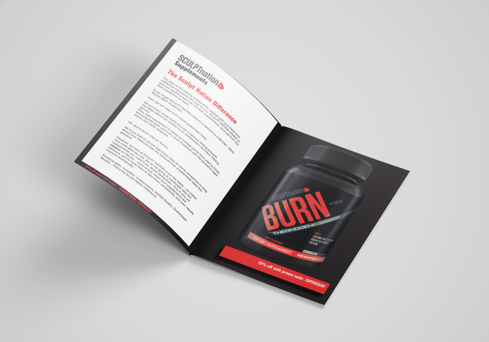
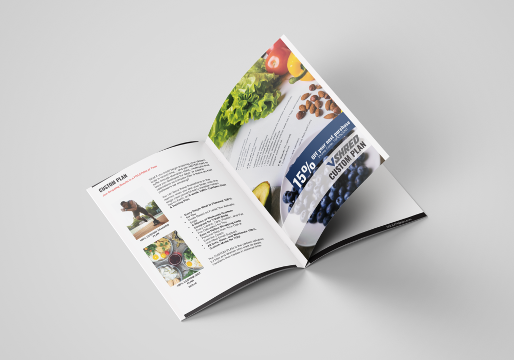
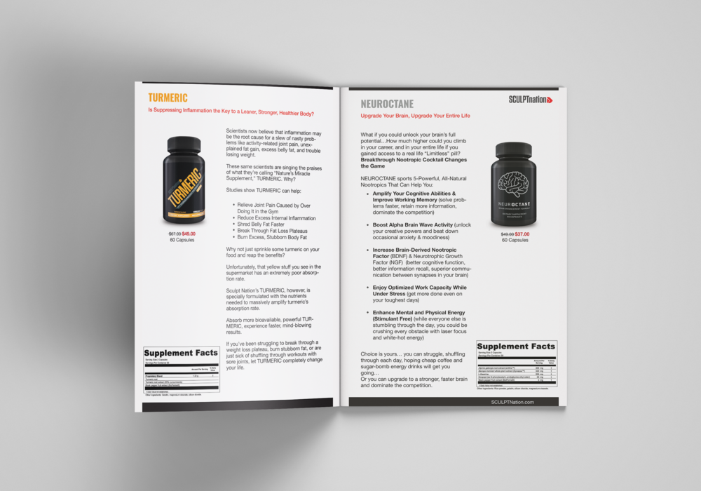
Sculpt Nation - Print Catalog
Challenge: Sculpt Nation and Vshred are teaming up to offer a print catalog to customers.
Solution: Create a clean way to show our product offering.
Method:
Low Fidelity Wireframe
High-Fidelity Design (Illustrator)